“Our lives are saturated by color. The sky above us is blue (or gray or pink or purple or nearly black). The grass we walk on is green, though sometimes it is brown. Our skin has color, though not exactly the color we normally ascribe to it. Our hair has color, even if that color inevitably changes with time – and may change again with the skill of our hair colorist. Our clothes have color; our furniture and our houses, too. Our food has color; so do milk, coffee, and wine. Color is an unavoidable part of our experience of the world, not least as it differentiates and organizes the physical space in which we live, allowing us to navigate it.”
From On Color by David Scott Kastan with Stephen Farthing
For as long as I can remember I’ve suffered from a complicated relationship with color. Often in the morning, I stay in front of the mirror for too long, changing tops or scarves of different colors until I find the one that matches, or that doesn’t suppress, the way I am feeling. Colors signify or evoke my emotions. Therefore, the clothes I wear and the environment I gravitate toward are connected to how I feel on a given day. I can articulate each sentiment with a color. And vice versa, different colors can open me to different moods. Unfortunately, I have never been able to solve this riddle and create a graph of colors and their corresponding feelings. I cannot always easily say, “Today, I feel violet, or green,” and get dressed quickly. The more layered are my emotions, the more time I will spend searching for the right nuance (which, of course, drives me crazy, especially when the time is limited).
It was the Sunday before Thanksgiving and my family’s long-awaited vacation. My “to do” list was long, and the day ahead of me was looking short and gray. I wanted to get dressed quickly so I could start crossing tasks off my list. I reached for a bright blue sweater, but I couldn’t agree with the color. First, I changed pants and skirts and boots, and then I tried adding different necklaces and scarves to make the color cooperate. Nothing helped. I wasn’t feeling in the shades of blue.
The kids have been long awake and needed food and attention and fresh air, and I kept thinking about the list. The letters that formed words on my list (anxious words now incompressible) enlarged by each breath until I found myself engulfed with panic. Some articles needed to be written and a workshop required to be prepared, and parent-teacher conferences to be attended, and errands to be run, and a ton of laundry to be washed, and the packing. And the packing. And the packing.
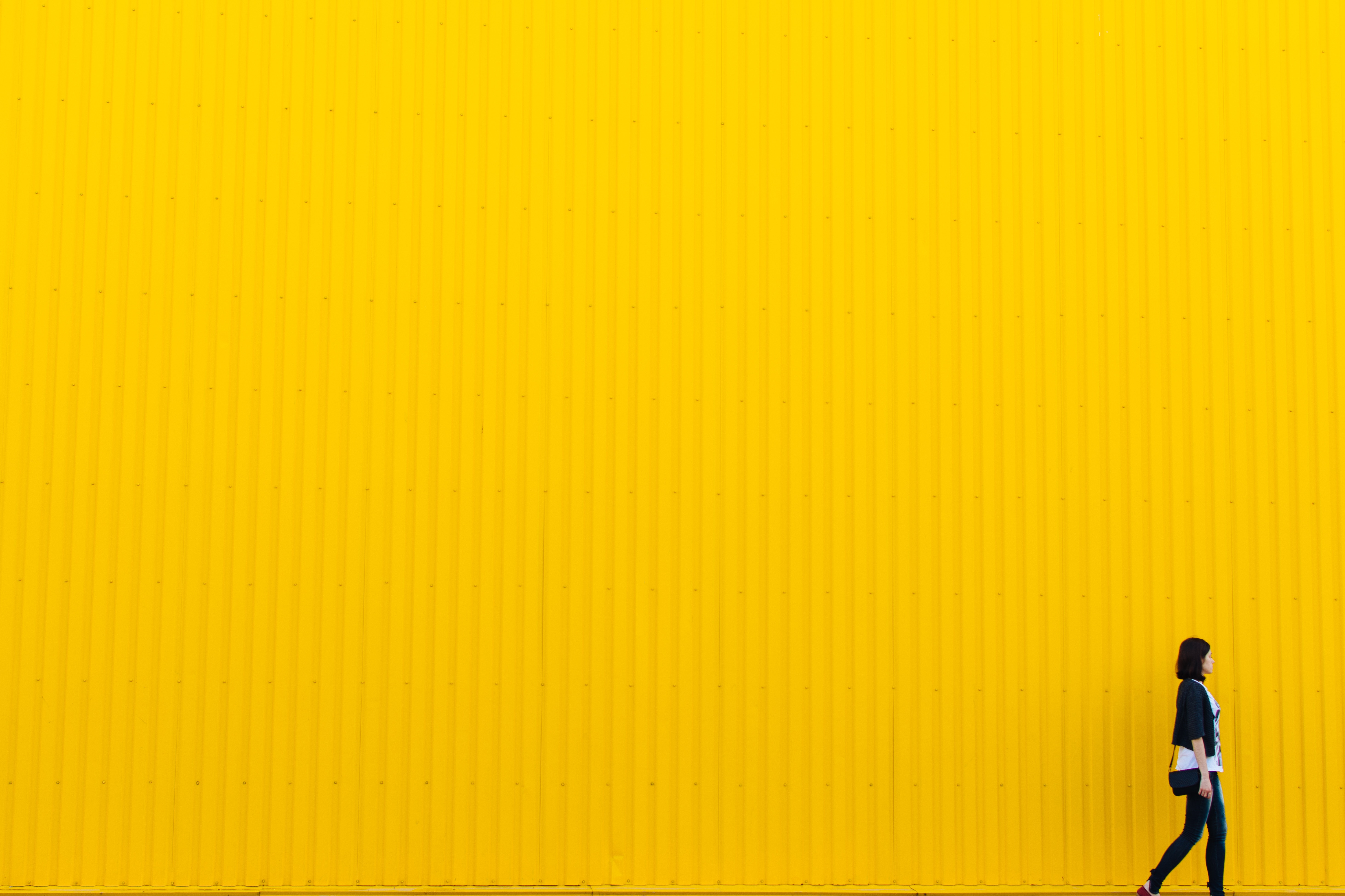
The panic is bright yellow. It’s as brilliant as the afternoon sun that attacks my eyes through the windshield on a day when I forget my shades — the sun that blinds me to the point of threatening to drive me off my lane and into a vehicle approaching from another direction. The panic is bright yellow. So, I never wear bright yellow. I don’t eat bright yellow or drink bright yellow, and I don’t touch or smell bright yellow, or allow any shiny yellow objects to surround me.
My face must have turned very bright yellow when my husband reacted and organized the kids to go biking and give mommy some space to calm down and change her colors.
I wanted to put on the bright blue sweater that for days hung in my closet: the color of the sea in the early morning, the color of the first love, and freedom. But it didn’t work that way: I couldn’t choose to dress in freedom if I was, still, incarcerated inside the ugly, freaking yellow.
Red couldn’t help either (too intense), nor light gray (too quiet), nor black (too indifferent), nor white (too vulnerable), nor violet (too reserved). Plaids and stripes, and other patterns seemed too busy and unfocused on the problem.
Finally, after I changed a dozen times, piling discarded tops on my bed in a colorful jumble, I settled on a dark green sweater, and my breath restored its pace within minutes.
As a part of my ongoing 200 hours Yoga Teacher Training, I’ve been studying the Chakra System. Each of the seven chakras, the seven wheels of life energy situated along our spine, is represented with a particular color. Manipura is the Solar Chakra that corresponds to yellow. This is the chakra of our personal power and professional success. It stores the high volumes of energy, the charge of the Sun, the heat of the fire. When in balance, it gives us a sense of confidence, and we feel cheerful, energetic, and encouraged.
However, my resentment toward the yellow showed that my Solar chakra was out of balance. This is what happens: if a few days pass and I don’t find time to write, the energy center that supplies my professional success as well as my ego gets injured and turns against me wrapping me inside the unsupportable bright yellow. Inside the yellow, I panic.
Anahata (a Sanskrit word meaning unstruck) is the fourth chakra, or the heart chakra, located over the sternum, and associated with love. Its color is green, its planet is Venus, its element is air. Anahata is the center of our social identity. It impacts our relationships, love, and marriage. Heart chakra and its green color are associated with nature, and it’s believed to bring fullness to our lives. So, the best way to fight anxiety over our personal (in)success is to rely on the help of the ones you love and the ones that love you. The best way to balance the energy of our egos is to engage our hearts.
I wear green to remind myself that I love deeply and that I am loved. I wear green to shrug off the anxiety over the unpredictability of the future. I wear green to restore my connection to nature.
Color helps my mind to understand my heart. Feelings have never been easily expressible with simple words. They need to be painted in colors. There are many nuances to each color, and there are numerous variations of feelings. There are different expressions of love, and there are diverse kinds of love that can exist concurrently in one open heart.
In the week leading to the vacation, I have been occupying my mind with the thoughts on color. I went to the library to pick up a book that was on hold for me, the one I chose to bring on my trip, and, to my surprise, my eye landed on a shelved book with a striking cover titled On Color by David Kastan with Stephen Farthing. I brought it home and devoured it between the dusk and the dawn.
The next day, I started thinking beyond the colors of my feelings. I thought of all that color demarcates: gender, race, age, nationality, culture, political and class affiliation, sexual orientation. My mind spun rapidly, and I felt overwhelmed. The crushing feeling of being overwhelmed responds to the orange, and I’m not a lover of the oranges.
Color is the most subjective feature of the world around us. Wise minds disputed over color for centuries. Chemists, physicists, physiologists, and neurobiologists were in constant disagreement over the human ability to see and distinguish colors. Then, the philosophers added to the equation, proposing the ontological question of color (the painful “what is it” matter). What I learned reading Kastan’s and Farthing’s book is that color has always existed on the borderland between objective and subjective, the phenomenal and psychological.
Color is never an attribute of things; color comes alive through the relationship of light and our minds. Color is relational.
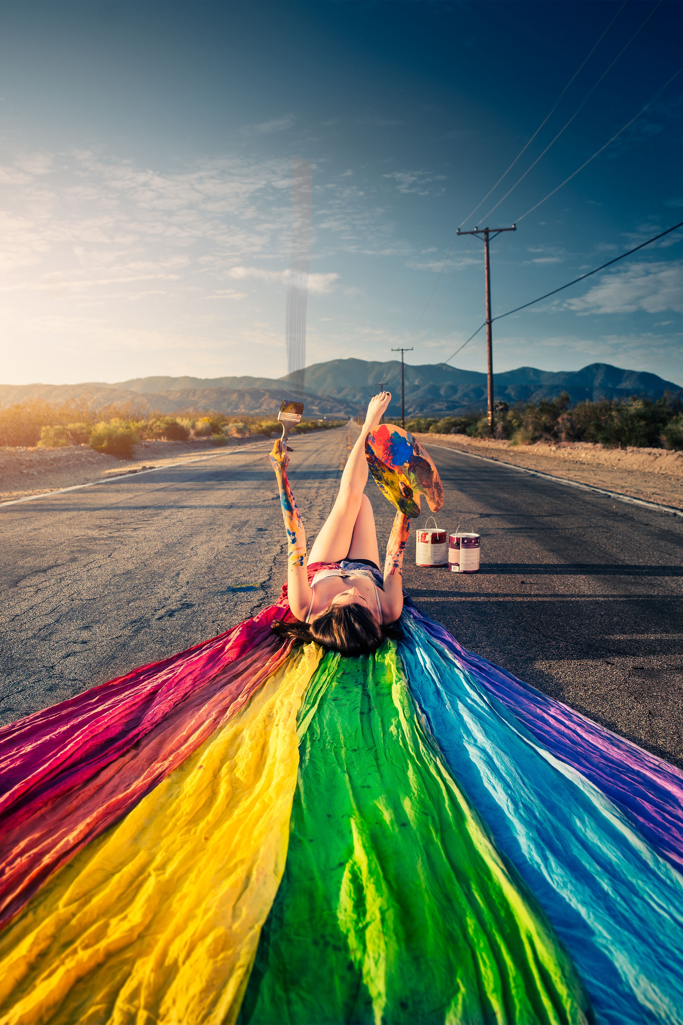
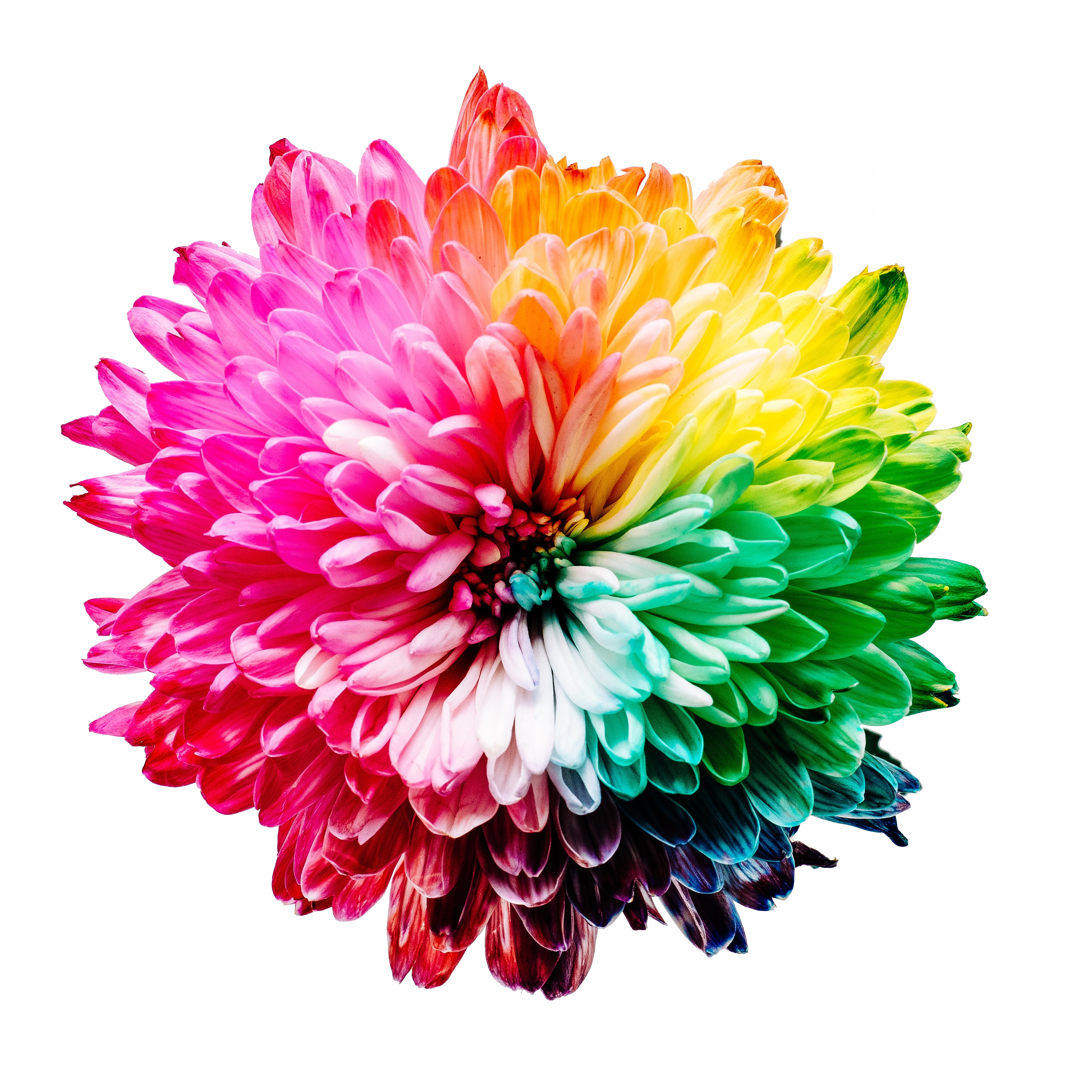
One of the most argued questions about color in history was how many colors are in the rainbow. Aristotle saw only three. Two thousand years after Aristotle, John Milton wrote about the three-colored-bow across the sky. Some artists and poets saw four, some distinguished five. Titian saw six. Then one day, Isaac Newton decided that rainbow was seven-colored, and his opinion, though faith-based, remained relevant to the day. And there are seven colors in the Chakra System, each affiliated to one of the seven energy centers.
My three-and-a-half-year-old daughter has some strong beliefs about colors. A color that is not in a rainbow is not a color at all, and by no means, she’d had any contact with it.
I speak and read in three languages (each from a different group of languages), and I understand how colors are perceived differently through different cultures. Some words describing color are untranslatable from one language to another. Some hues do not exist in all languages. Turquoise, for instance, exists as a shade of blue and a shade of green. Hungarians have two different names for red, both of which they use with a significant difference. However, both of their reds can only be translated as “red” to the English language. “Physiology determinates what we see, culture determinates how we name, describe, and understand it,” wrote David Kastan. “The sensation of color is physical; the perception of color is cultural.”
But in the eyes of artists, all these scientific and psychological disputes remain irrelevant. In arts, there are no confusions and misunderstandings over color because there are no rules but this one: color is personal. Color is an emotional state rather than a quality of things and the world. What matters to me when I think of a color (or in color) is how that color makes me feel.
I wasn’t able to cross off everything on my list before departing to the vacation. I resumed writing this piece in the beautiful island of Antigua, surrounded by the divine colors: the bright blue of the cloudless sky, the deep ocean blue of the water, the foamy white of the waves crashing onto the rocks, the moist, soft green of the plants, the tender pinks and reds of the flowers.
I hadn’t sensed any yellows since I’ve arrived here since I’ve anchored my heart to the serenity (temporary, I know, but rewarding). In these peaceful days, the colors I see and feel are the colors I choose to wear: blues, greens, whites, and reds.
Another thought crossed my mind: locations own colors too. I can name each place I ever visited by the color I was feeling while being there. And those colors are the most personal. I don’t go back willingly to the places that made me think yellow or orange. I don’t like snowy mountains because too much white makes me fearful. I can’t find peace and joy in towns that strike me as dark and monochrome because they quickly kill my imagination. I love the cities that are red, or pink, or magenta – all hues of passion. And seaside towns that are wrapped in dreamy rainbows and always pleasing to my eyes and heart. Blue places keep my dreams alive. I love the greens of the endless vineyards and rolling fertile hills sprinkled with flowers. The greens open me to creativity.
Paul Cezanne said that color is a collaboration of the mind and the world. In my life, color is a collaboration of my mind and my heart. Understanding my colors is the key to understanding my soul.
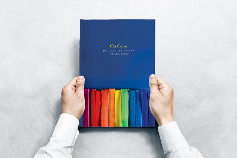
On Color by David Scott Kastan with Stephen Farthing
Yale University Press
May 22, 2018
272 pages, 6 x 7 3/4
47 color illus.
ISBN: 9780300171877
Hardcover