Every Page is a Work of Art
Issue No. 7 ~ April, 1997
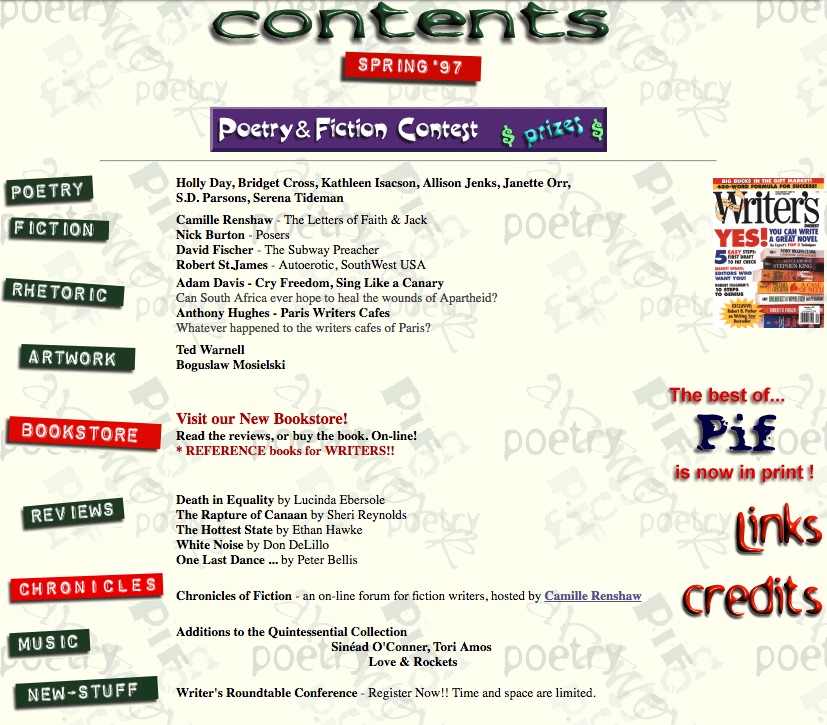
The very early issues were unique on every page. There was really no rhyme or reason to how the pages were laid out, or the artwork that was included on them. As you can see from this screenshot, it was a hodgepodge of various colors and designs. And most of it, like the internet at large at the time, was a confusing cacophony of clutter.
It was also a time when the color red became a dominant part of the Pif name and logo.
The Era of the Big-Logo-With-A-Red-Swoosh
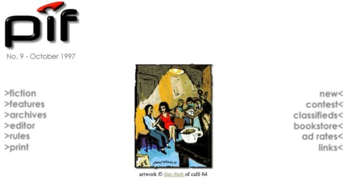
Issue No. 9 ~ October, 1997
The homepage became very simple around Issue No. 8, primarily because it became too time-consuming to create custom text art for each page, for each issue. Some “standardization” was required, simply to speed up production and get the issues published on time.
With slightly-fuzzy gray text that sharpened and darkened when hovered over (yeah Javascript!), the homepage tried to speak to a print readership that had just started venturing online. The homepage included a dramatically large logo with a red swoosh — which was pretty much legally required in order to operate online in the late ’90’s. Digital artwork created specifically for online display was a relatively new artform at the time and the magazine prominently featured several of the more well-known artists, including Dan Rhett and Ted Warnell. Ted was doing animated giphy art nearly two decades before it became the artform du jour. His immense contribution to the genre can not be understated.
Drop Shadows and Banner Ads – Everywhere!
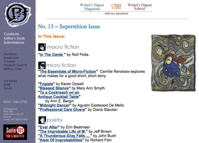
Issue No. 13 ~ June, 1998
In early 1998 Pif Magazine began working with Writer’s Digest Magazine and the wonderful (now defunct) Story magazine to sell subscriptions online. Neither publication had an online presence at the time and selling subscriptions online was new to them (and to Pif). The best advertising mechanism either of us could come up with was to run banner ads on every web property Pif could access. This included Pif Magazine and Penguin Search, a literary-themed search engine of author websites, online zines, and other resources for writers. We also decided it would be a good idea to change the logo to look like it had been punched so hard by Chuck Norris as to have smashed through the raised sidebar and become imprinted upon the white page below. The late ’90’s was also a time when (nearly) every ‘zine online was proudly displaying badges for the various awards they had received from other online ‘zines.
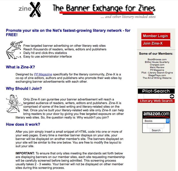
Pif has always been an advocate for new voices online. In the late ’90’s the magazine operated Zine-X, a banner-exchange network of several hundred online literary magazines. The purpose was to build awareness of (and generate readers for) all of the great new publications that were sprouting up at the time. This awareness was predominantly generated by the spread of provocative banner ads like this one across the web.

Getting Sued is a Good Thing, Right?
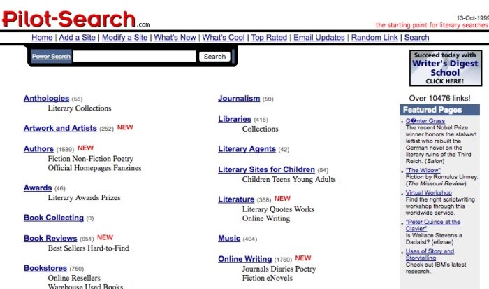
Actually, Pif was not sued. Pif was only threatened with legal action via a very tersely worded letter on very official looking letterhead. But it sounds edgier in retrospect to say we were sued. Turns out, Penguin Search was a great idea with a really bad name. Penguin Books thought it was a good name, but unfortunately too similar to their name and asked that the site be shut-down. Or at the very least, the name changed. So Penguin became Pilot-Search – which in hindsight, was yet another really bad name for a great idea. Users consistently complained about not being able to find a single airplane pilot on the site.
How About Toning Down Those Drop Shadows?
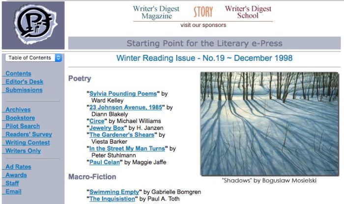
Issue No. 19 ~ December, 1998
Fair enough. This version of the site took on a softer tone, removing most of the drop shadows, but compensating for this lack of depth by putting extra-long underbars beneath the links in the side-nav bar.
Can We Tone It Down Even More?
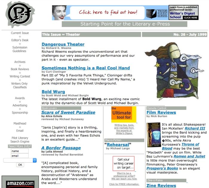
Issue No. 26 ~ July, 1999
Who doesn’t like dirty olive drab? Especially when paired with bright blue text? And no more drop shadows? No one, that’s who. This approach at minimalism was intended to de-emphasize the left-hand nav so that the eye would flow to the primary content box instead. In general, despite the color pallet, it was a pleasing layout. Instead of drawing readers into the main content, though, it caused readers to question reality and wonder things aloud, like: What does “Archives divided by Book Reviews” even mean? And to ask … is the image for the Film Review section crooked? It’s crooked! Right?! Am I the only one seeing this? Why is it crooked?
I Like Big Swooshes and I Can Not Lie
Issue No. 34 ~ March, 2000
The 3D swoosh logo made a return in 2000. The return was due less to the utter non-readability of the “smashed” logo and more to the recent purchase of some software for turning text into 3D art that had to be justified. As far as layouts go, this was about as simple as could be. The goal was to get to the essence of the magazine: the content. The color pallet was reduced to red, black, and blue. The font was Arial, preinstalled on every computer on the planet, and only 3 font sizes were used. Each page in each issue at the time was “hand-built” PHP with inline styling. A simplified layout allowed “templates” to be built that could be copy/pasted to create new pages as the editors selected content for inclusion in an issue.
Hey, Those Images Are Crooked?
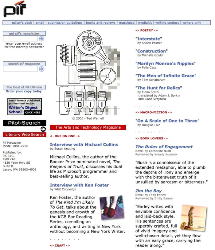
Issue No. 42 ~ November, 2000
Why yes, yes they are. In 2000, Pif converted from hand-crafted web pages to a PHP-based content management system (CMS). As far as CMS systems went in late 200, the one the magazine used was really good at facilitating the creation, organization, and publication of content for the magazine. But it was terrible at displaying that content in anything other than a 2- or 3-column layout. The cockeyed images were an attempt to “break up” the monotony of the very rigid columns.
Same Columns, Different Colors
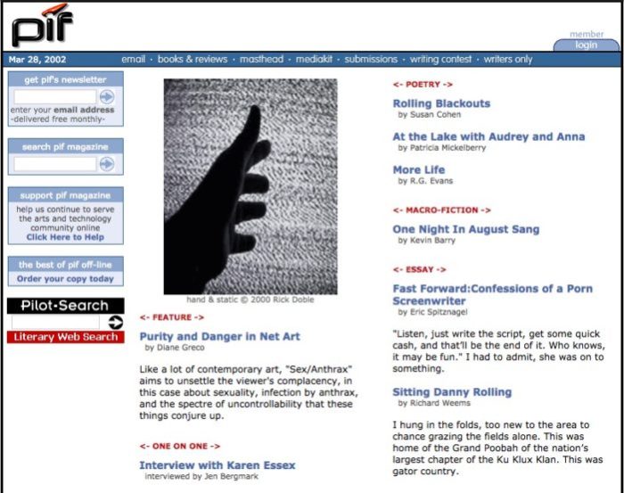
Issue No. 58 ~ March, 2002
In 2002 the magazine moved from it’s PHPNuke-based CMS system to a custom-built system we lovingly named SIDney, as every post on the site came with it’s own unique URL that started with the word SID. SIDney allowed editors to do crazy things like link related stories together, or link readers to other content by the same (or similar) writers. It could have a been a serious CMS contender, if not for a scrappy startup called Automattic! and their WordPress blogging tool that did just about everything better.
Remember When Magazines Were Printed on Paper?
Issue No. 158 ~ July, 2010
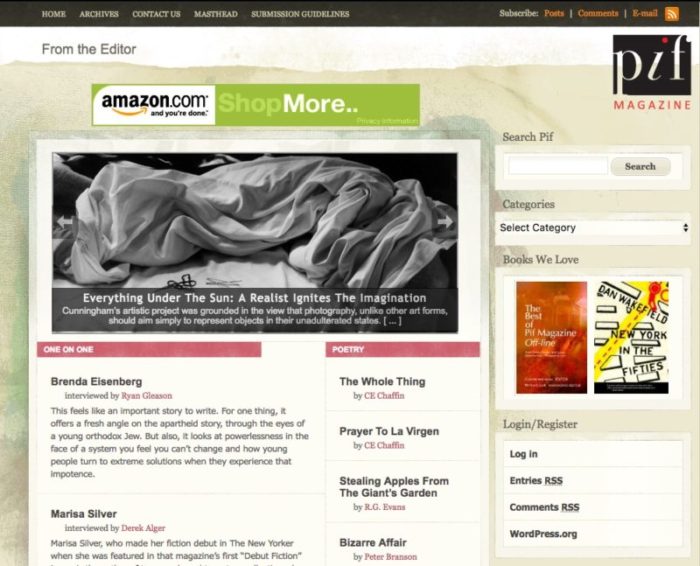
In 2010 Pif Magazine adopted WordPress and editors everywhere rejoiced. WordPress is a beautiful beast. Beautiful in the sense that it takes editorial tasks that previously were very difficult (version tracking, image management, content cataloging) and makes them painlessly simple. A beast in the sense that there are a ton of fugly WordPress themes out there, and even more for selling stuff online — but very few themes designed for organizing and displaying long-form content in any layout other than a chronologically-ordered blog. The magazine adopted the Papercut theme, mostly because it contained one of our standard colors (red) and made us look vaguely magazine-like. Finally, the logo was given a much-needed update. The red dot over the ‘i’ remained, though the remainder of the logo was given a flatter, more modern look.
Simplify, Simplify, Simplify
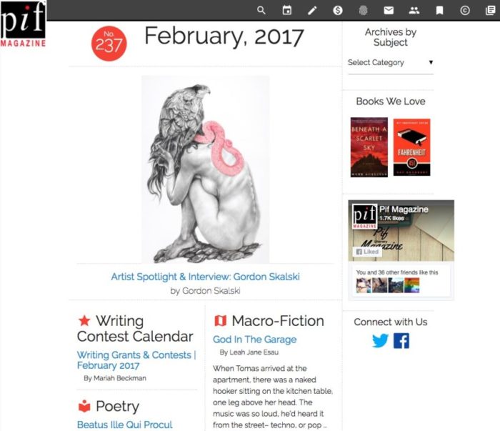
Issue No. 237 ~ February, 2017
The current theme is called Literalize, which is a mashup of the terms literary and materialize. It’s a completely custom-built theme based upon Google’s Material Design philosophy (as implemented by the Materialize CSS project). This current design allows Pif to render with (relative) consistency across multiple screen sizes and devices. This becomes increasingly important, as Pif‘s readership has gone from less than 5% on mobile to greater than 40% in a little under 3 years. Mobile readership is expected to cross the 50% mark by mid-2018. Materialize CSS is not a perfect implementation of Material Design thinking, but it’s a really good start. And it’s continually evolving. It’s Pif‘s intention to actively contribute to that evolution.
Huge shout-out to the Internet Archive’s Wayback Machine. Without their wonderful service, this visual history would have been lost. Please make a donation today to help keep them running.